
Micro animations in React with Framer Motion
TLDR;
- Framer Motion can be used for simple and complex physics animations
- Micro animations can enhance the user experience
- They can give a web app a much more polished look
Micro animations and interactions can enhance the user experience and also make a web application look more cleaned up and polished 💅.
There are some principles to get interactions and animations right. Still, such details often do not get prioritized in our fast-moving feature-focused world and therefore are not well discussed. Nowadays, libraries like Framer Motion make it more accessible to develop high-quality animations without in-depth knowledge about issues like performance or accessibility of animations. Primarily more realistic motions can be described easier than ever. In this blogpost we are going to build the following physics based micro animations.
Tiny details often can make a huge difference
Do you prefer using a todo app that gives you easy redo and un-do capabilities and where you see clearly which todo items is done or, on the other hand, has a clunky, overly complex user interface in front of you? For example, the famous Todoist app gives you an easy undo mechanism and animates your completed task smoothly into the finished area.
The website https://littlebigdetails.com/ was a fantastic place to explore tiny details, but it did not get many updates in the last few years. You can still see a lot of older excellent examples there.
In this blog post, I want to show how to create a realistic tiny micro animation that you can implement using spring physics with Framer Motion and React. As I have mentioned, a micro animation can get a more natural look using spring physics. Down below, you can see two examples from Stripe and Firebase use such tiny micro-interactions in their websites.

You can see this example in action on Firebase (visited 2021)

You can see this example in action on Stripe (visited 2021)
Framer Motion
Framer Motion lets you define spring animations without complex definition and you can also easily
use the useReduceMotion API to make animations
more accessible, since we also have to make sure to avoid (motion sickness) When we use animation a
lot and we can get Motion sickness is real.
React has a lot of really great animation community and a lot of great open source libraries like
- React-Spring and
- Framer Motion are one of the most used ones libraries.
- React Motion
- react-transition-group
While Framer Motion is a bit bigger in the overall bundle size, it is more widely used, performant and offers a great developer experience while also making advanced animation based on spring physics much easier to implement.
Natural animation
Spring animation and physics animation libraries are focused on modeling natural world forces like gravity, friction, and fluid dynamics into animation.
It is a technique that makes the animation look a lot more natural. It is based on three variables
- stiffness (how fast the animation is)
- damping (how long it takes till an animation will come to an end)
- mess
You can read more about spring animations in an awesome blogpost by Josh W Commeau or have a look in to great react europe talk by by Chenglou.
Let's create some micro animations
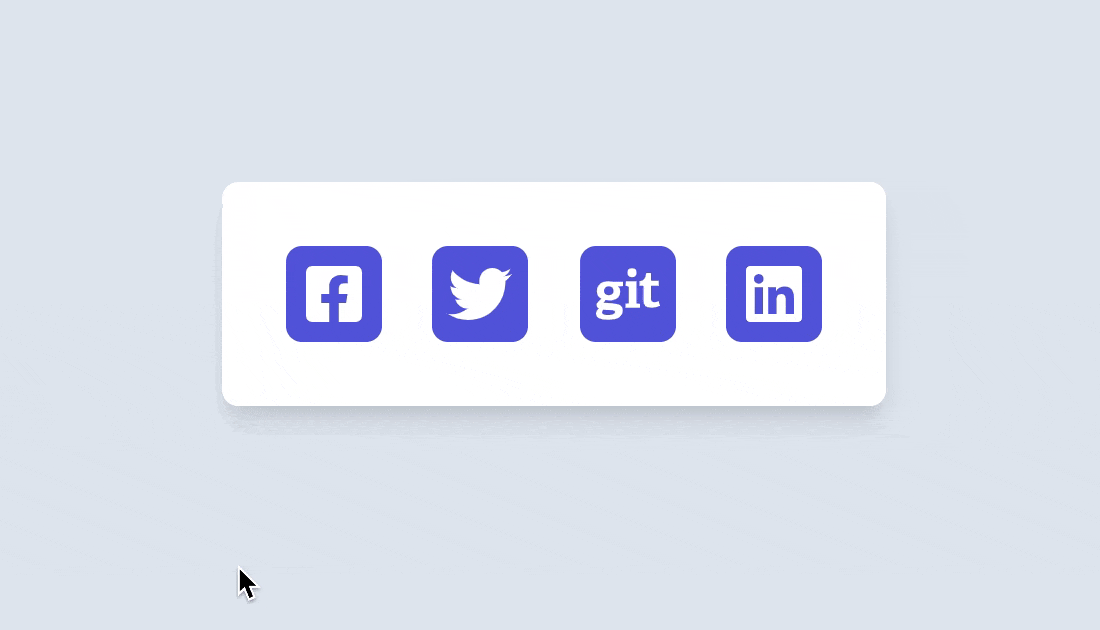
We will create an example with small micro animations using framer motion. As many of the current websites have social icons. As seen in the example below, you can make them more interactive and fun using hover animations.
Try to hover over the icons to see them in action.
We will create four different hover animations. To get started, we will create a new Create React App and add some basic styles to it and social icons using the popular react-icons package.
npx create-react-app mirco-animation-example --template typescript

cd mirco-animation-example && npm install react-icons
Now, let's add some basic styles for our example.
/* styles.css */

body {
  background: #e2e8f0;
}

.App {
  font-family: sans-serif;
  text-align: center;
  background: #e2e8f0;
}

.card {
  background: white;
  width: min-content;
  position: absolute;
  margin-left: auto;
  margin-right: auto;
  top: 30%;
  left: 0;
  right: 0;
  text-align: center;
  padding: 2rem;
  border-radius: 8px;
  box-shadow: 0 10px 15px -3px rgb(0 0 0 / 10%), 0 4px 6px -2px rgb(0 0 0 / 5%);
}

.card-social {
  display: flex;
  font-size: 2rem;
  color: lightGray;
  justify-content: center;
  align-items: center;
  gap: 1.6rem;
}

.social-icon-wrapper {
  background-color: #5c5edd;
  color: white;
  display: flex;
  border-radius: 8px;
  justify-content: center;
  align-items: center;
  width: 3rem;
  height: 3rem;
}

a {
  color: inherit;
  padding: 0;
  margin: 0;
}
Framer Motion provides a small API surface to integrate hover animations. You can use any basic HTML
tags motion.div prefixed by motion tag. This is the same API surface as
Styled-Compoents has.
You can use any HTML tag with the prefix motion like motion.div, motion.article or
motion.svg to define a new tag. In the example below, we will use the whileHover property of the
tag to animate the social icons. You can define what should happen to the element when a user hovers
over the div. In the case below, we will rotate the icon by 9 degrees and scale it up by 1.4 and
transition the color from #5c5edd to #FF008C.
<motion.div
  whileHover={{
    rotate: 9,
    scale: 1.4,
    background: ['#5c5edd', '#FF008C'],
  }}
>
You can play around with different styles, as you can see below.
import './styles.css'
import { FaFacebookSquare, FaTwitter, FaGit, FaLinkedin } from 'react-icons/fa'
import { motion } from 'framer-motion'

export default function App() {
  return (
    <div className="App">
      <main>
        <div className="card">
          <div className="card-social">
            <motion.a
              href="https://www.facebook.com/"
              target="_blank"
              rel="noopener noreferrer"
              whileHover={{
                rotate: 9,
                scale: 1.4,
                background: ['#5c5edd', '#FF008C'],
                transition: { type: 'spring' },
              }}
              className="social-icon-wrapper"
            >
              <FaFacebookSquare />
            </motion.a>
            <motion.a
              href="https://twitter.com/JCofman"
              target="_blank"
              rel="noopener noreferrer"
              whileHover={{
                rotate: -50,
                scale: 1.2,
                transition: { type: 'spring', stiffness: 900, damping: 11 },
              }}
              className="social-icon-wrapper"
            >
              <FaTwitter />
            </motion.a>
            <motion.a
              href="https://github.com/JCofman"
              target="_blank"
              rel="noopener noreferrer"
              whileHover={{
                rotate: 360,
                scale: 1.2,
                transition: { type: 'spring', stiffness: 900, damping: 20 },
              }}
              className="social-icon-wrapper"
            >
              <FaGit />
            </motion.a>
            <motion.a
              href="https://www.linkedin.com/in/jcofman/"
              target="_blank"
              rel="noopener noreferrer"
              whileHover={{
                scale: 1.1,
                transition: { type: 'spring' },
              }}
              whileTap={{
                scale: 0.9,
                transition: { type: 'spring' },
              }}
              className="social-icon-wrapper"
            >
              <FaLinkedin />
            </motion.a>
          </div>
        </div>
      </main>
    </div>
  )
}
As you can see above we use the whileHover property to animate our components on hover. This is the critical and magical part of the code.
We can use most of CSS animatble properties like transform properties
- translate
- scale
- rotate
- skew
- perspective
or
colors, scale, rotation, shadow.
Framer motion uses tween and spring animations (based on the type of the value being animated) as a default to animate.
You can also predefine various states in Framer Motion effects using variants and apply the transform based on hover.
With this feature, you can also animate multiple react components with one interaction. For example, we can create a button where an Icon gets this slick animated effect. You can create differently IconAnimation styles. I tried to replicate the one from the Firebase and Stripe example. We declare a variant object with the initial state of "rest" and a "hover" state. We then use a motion.button component to declare the initial state and hover state.
https://codesandbox.io/s/blog-micro-animation-cta-buttons-loi7y
We also need to add some additional CSS styles.
.card {
  width: min-content;
  position: absolute;
  top: 30%;
  left: -70px;
  text-align: center;
  padding: 2rem;
  border-radius: 8px;
  box-shadow: 0 10px 15px -3px rgb(0 0 0 / 10%), 0 4px 6px -2px rgb(0 0 0 / 5%);
  background: linear-gradient(-45deg, #ee7752, #e73c7e);
}

span {
  font-family: 'Inter', sans-serif;
  font-weight: 300;
}

button {
  border: none;
  display: flex;
  justify-content: center;
  align-items: baseline;
  gap: 1rem;
  width: 200px;
  font-size: 1.4rem;
  font-family: Arial, Helvetica, sans-serif;
  background: darkslategray;
  border-radius: 5rem 5rem 5rem 5rem;
  box-shadow: 0 10px 15px -3px rgb(0 0 0 / 10%), 0 4px 6px -2px rgb(0 0 0 / 5%);
  color: white;
  background: rgba(255, 255, 255, 30%);
  padding: 8px 6px;
  margin: 10px;
  line-height: 1rem;
  cursor: pointer;
}

button span {
  display: flex;
  justify-content: center;
  align-items: center;
  align-self: center;
}
and then we can use the initial property of a motion tag to define an initial state.
const iconMotionSetting = {
  rest: {
    rotate: 0,
  },
  hover: {
    rotate: 50,
    x: 5,
    transition: { type: 'spring', stiffness: 400 },
  },
}

;<motion.button initial={'rest'} whileHover="hover">
  <motion.span variants={iconMotionSetting}>
    <RiSettings3Line />
  </motion.span>
  <span> Settings </span>
</motion.button>
Below is the complete example with the arrow motion example.
import './styles.css'
import { RiSettings3Line, RiArrowRightSLine } from 'react-icons/ri'
import { motion } from 'framer-motion'
import 'typeface-inter'

const iconMotionSetting = {
  rest: {
    rotate: 0,
  },
  hover: {
    rotate: 50,
    x: 5,
    transition: { type: 'spring', stiffness: 400 },
  },
}

const iconMotionArrow = {
  rest: {
    rotate: 0,
  },
  hover: {
    x: 2,
    scaleX: 1.1,
    transition: { type: 'spring', stiffness: 1000 },
  },
}

export default function App() {
  return (
    <div className="App">
      <main>
        <motion.div className="card">
          <motion.button initial={'rest'} whileHover="hover">
            <motion.span variants={iconMotionSetting}>
              <RiSettings3Line />
            </motion.span>
            <span> Settings </span>
          </motion.button>
          <motion.button initial={'rest'} whileHover="hover">
            <motion.span variants={iconMotionArrow}>
              <RiArrowRightSLine />
            </motion.span>
            <span>Register</span>
          </motion.button>
        </motion.div>
      </main>
    </div>
  )
}
In the next blog post, I want to show how we can use framer motion for more complex animations.